Harken
PROJECT OVERVIEW
Optum was creating a complete responsive health care consumer portal for their Harken Health project that combined sensitive health information, secure messaging via email, text & video, scheduling, banking and insurance information into a single access point.
Significant resources were allocated to this project with the directive of setting the new standard on portal experiences.
Approach & Research
It was instrumental to success that each segment, division and discipline worked hand in hand from day one. Routine meetings would find BA's, PM's and Product Owners meeting with Development to ensure their vision was properly implemented and executed. Technical Requirement gathering and grooming became essential on an ongoing basis due to the complexity and scope of the project.
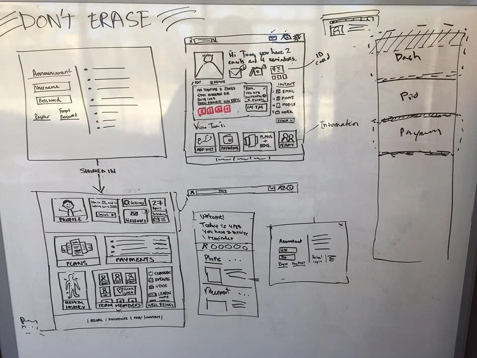
A variety of sketches and white board sessions helped many ideas to take shape. Not every one was great, but it helped us down the path toward what became the final product.
Strategy
The teams met with Marketing and Communications departments for inspiration and collaborated towards building excitement and expectations for a product that didn’t yet exist but was inspiring none-the-less.
This helped with our decision journeys, empathy mapping and personas which were then fed back through the Content Strategy & Copy to generate marketing content. All of this served two purposes: the first was to ensure that all involved teams stayed true to the vision of the Stake Holders while the second was to communicate with the community that Harken was coming to.
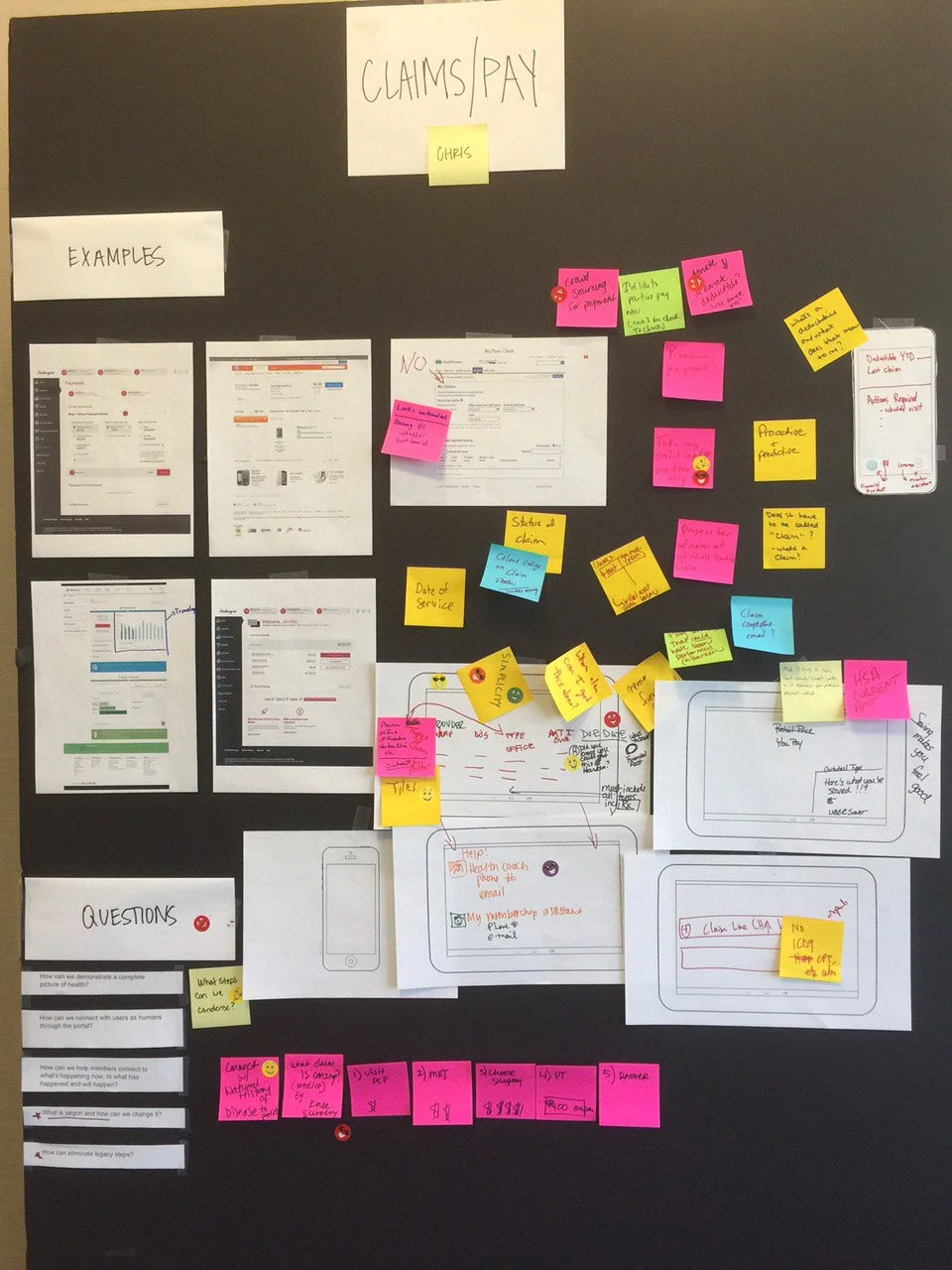
A flurry of brainstorming sessions combined with SME and end user interviews led to a plethora of potential features. Utilizing card sorting exercises, ideation workshops, SWOT analysis and peer reviews the backlog became manageable and the fun began: prototypes!
Process & Implementation
With a clear vision and proper direction on where we were going, the UX team would work on various portions of the portal creating prototypes and presenting the designs to the stake holder team for final approval. Once these prototypes were complete, the product would undergo A/B and multivariable testing where all changes and iterations would be consolidated into a single location.
After creating the final design and UX layout, proper documentation was created and disseminated to the Development and Stake holder teams for implementation. This in turn was fed into the Pattern Library so development could insure consistency and efficiency as they brought the portal to life.
End Result
After hundreds of people worked thousands of hours on product that made difficult and confusing easy to understand and actionable, I would love to say that Harken was universally hailed as a success and became a corner stone product for Optum.
Unfortunately, political and economic factors beyond our control had an impact on the project. Despite the praise received for the portal and its ease of use, it was cancelled after a trial run in Chicago and Atlanta.


