
WATCHMAN
PROJECT OVERVIEW
WATCHMAN was and continues to be an amazing alternative to life long medication when dealing with complications due to strokes and blood clots. When Boston Scientific decided to update their global style across all channels and mediums, it presented a problem in disturbing the fledgling marketing and experiences that consumers and businesses had just begun to embrace.
The Goal
Take a flagship medical device that had existing branding across every type of traditional & digital medium and incorporate it into the new corporate branding that Boston Scientific was embracing.
The biggest challenge was how to implement these changes without alienating an existing consumer and business client base that was familiar with an existing aesthetic and UX interaction pattern.
Approach & Research
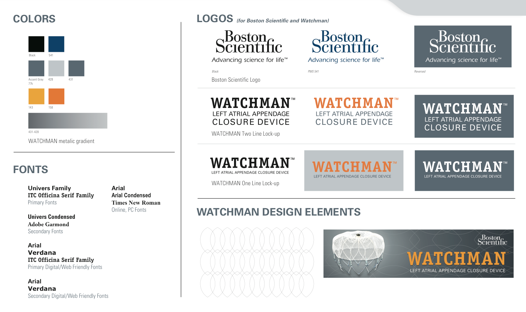
Working with business analysts and product managers, the first steps were to identify the current aesthetic style of WATCHMAN and familiarize the teams with both the Patient and Professional journeys of discovery and embracement.
How would that relate to the global Boston Scientific websites? Traditional print catalogs? What opportunities existed where we could intertwine the two styles and experiences? In order to get to the core of the matter, we jumped into a series of interviews with SMEs, consumers and business partners. A series of personas and discovery maps were created and shared throughout all of the collaborating groups.


Strategy
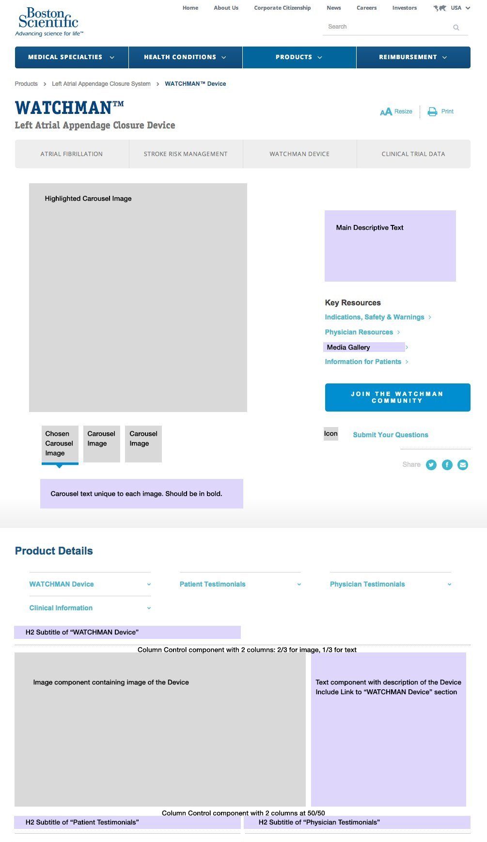
After some sketches were created through some white boarding sessions, the group began to get some tangible results. Insisting on open lines of communication with the Marketing and Development departments, a series of rapid online prototypes were created using AEM that allowed for user testing and feedback. With mostly positive results, minor revisions were made both in design aesthetic as well as UX architecture to make sure that the end product embraced the new style and flow of the global site while still maintaining brand recognition from the existing consumer and professional base.
Process & Implementation
Once the mock ups went through another round of user testing and had final approval from Marketing, development and design was able to take advantage of the design pattern library and role out automated emails, reprint brochures and implement the improvements throughout all of their channels.
End Result
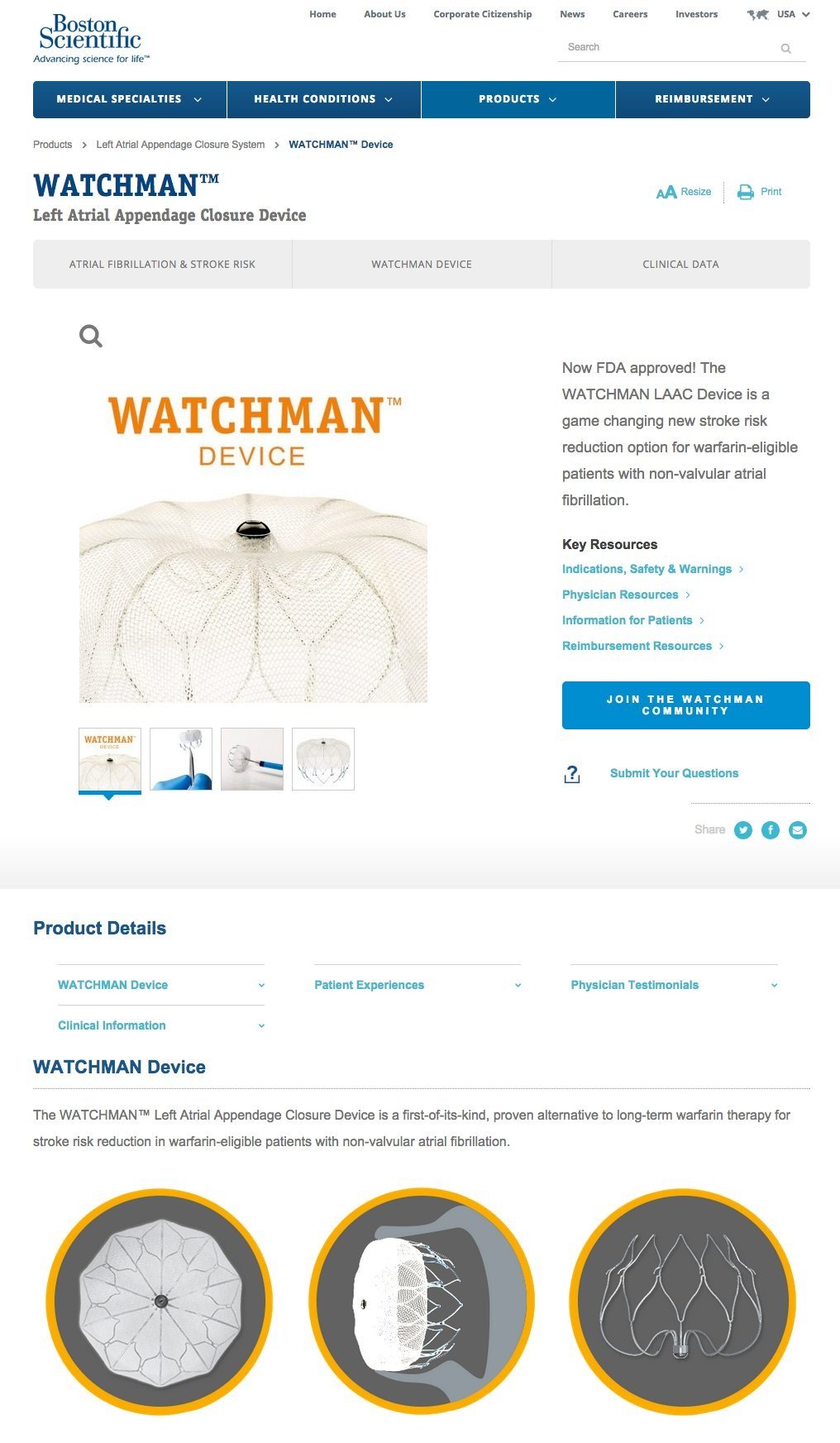
WATCHMAN was able to achieve true market unity across all of the distribution, marketing and information channels — keeping true to its original aesthetic while embracing the new global branding and style.

